
Pali Wine Co.
Customized merch allowed each customer group to embrace their place as locals, repping their neighborhood.
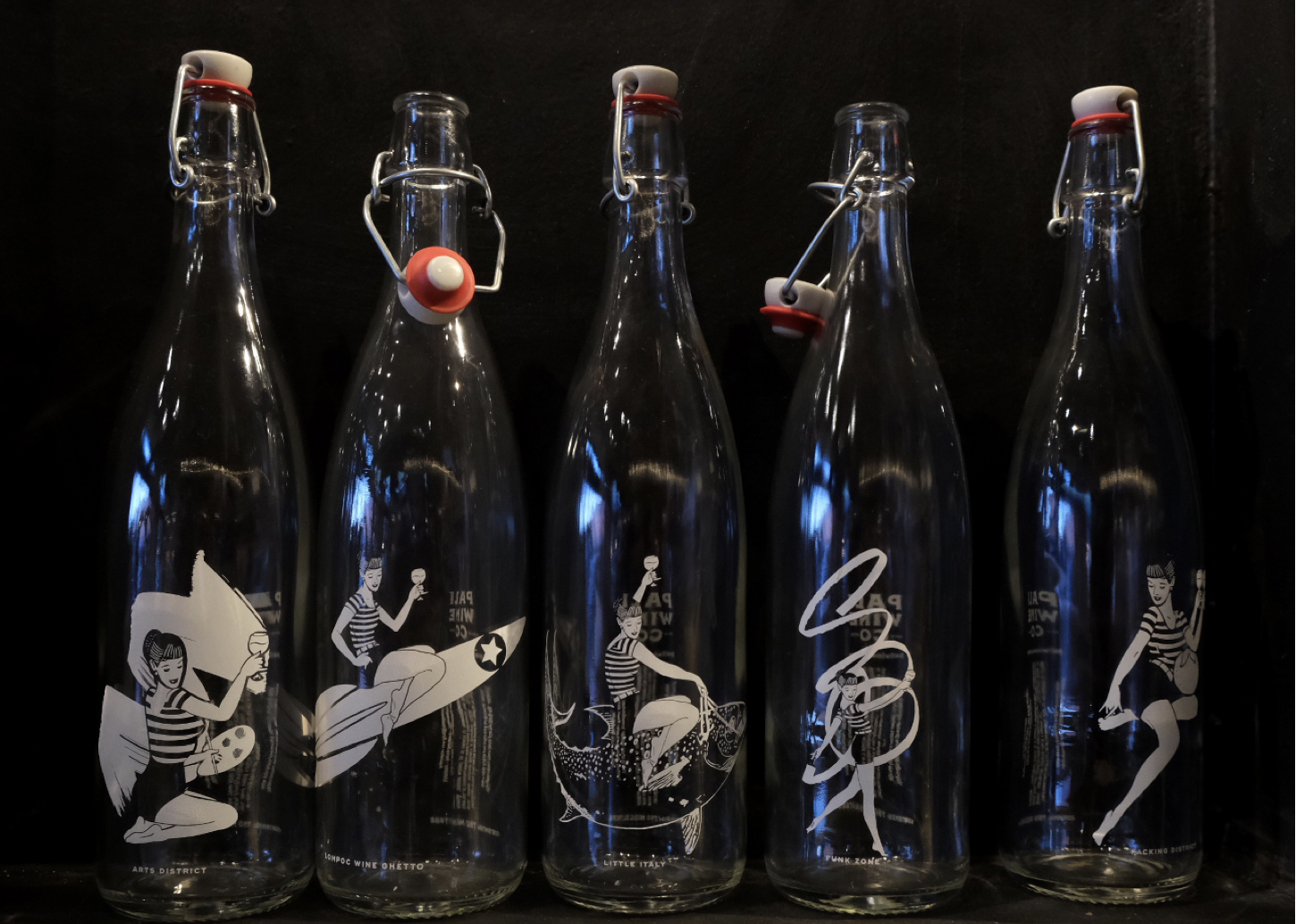
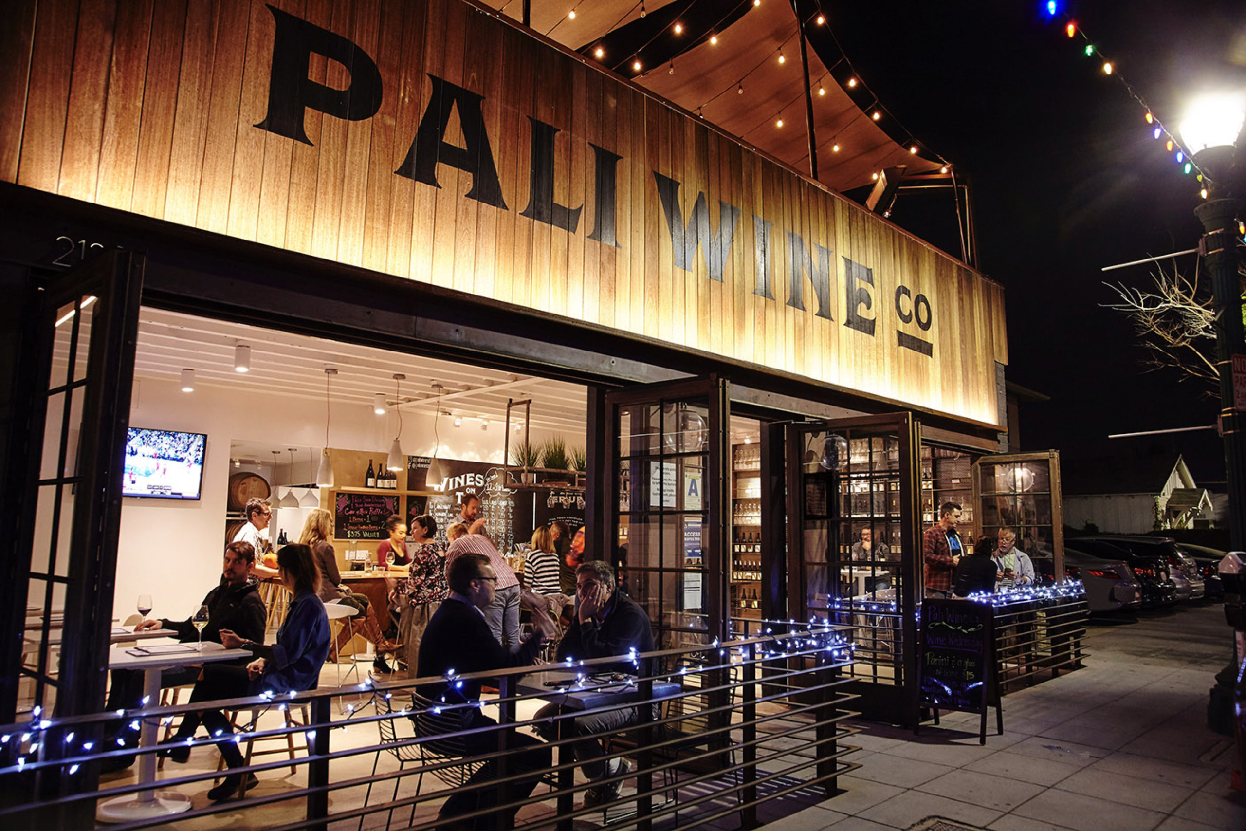
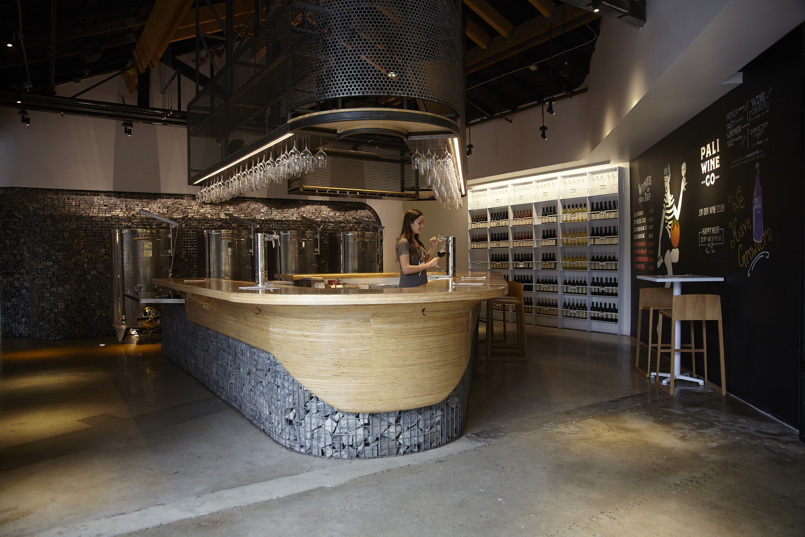
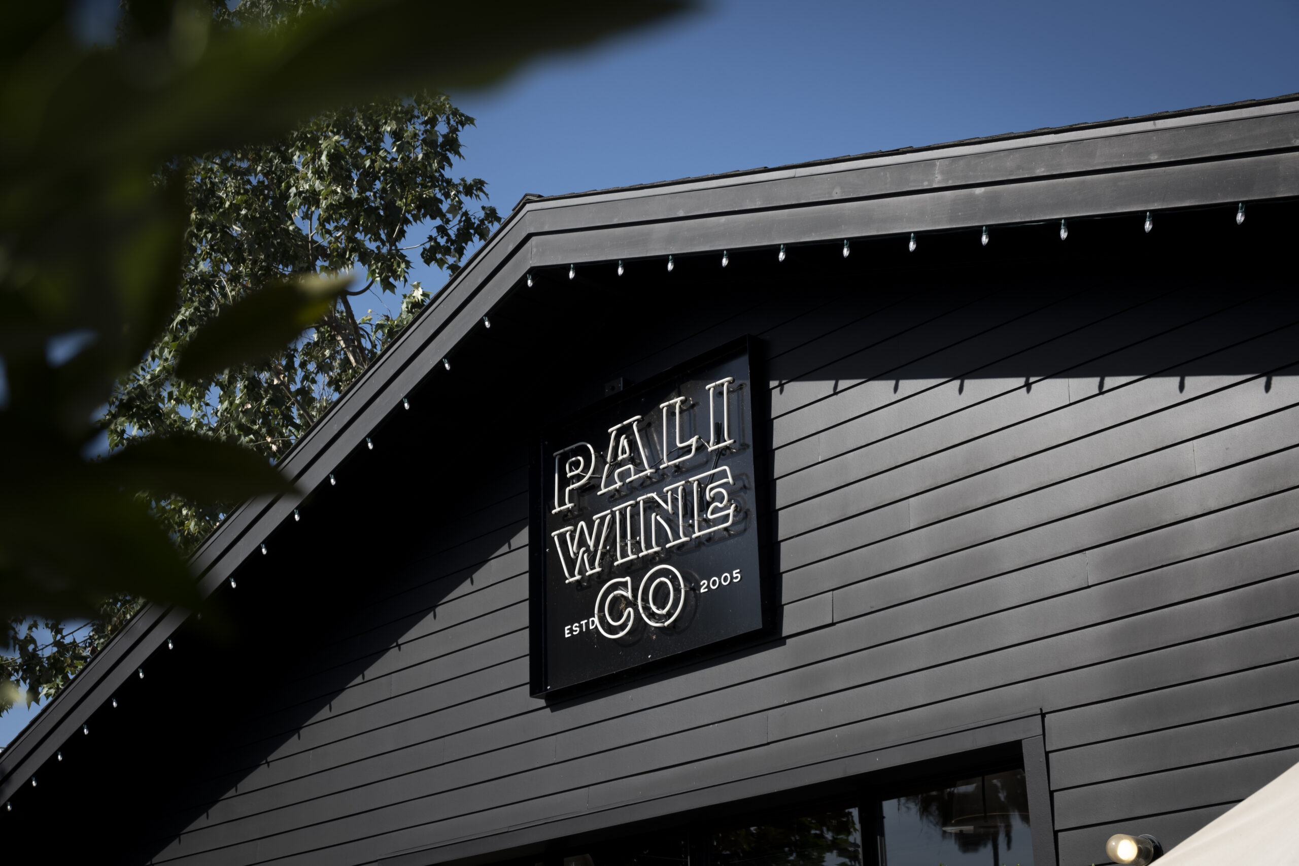
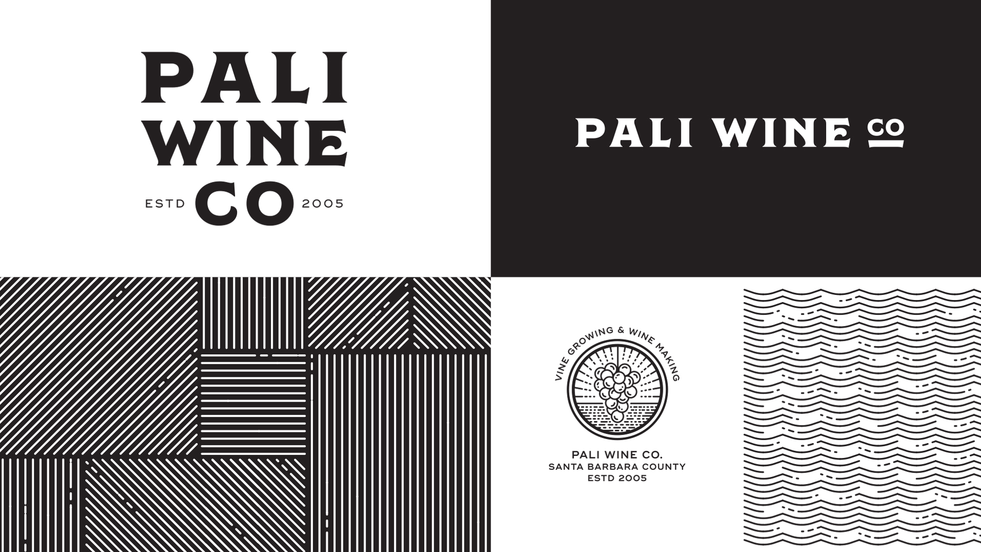
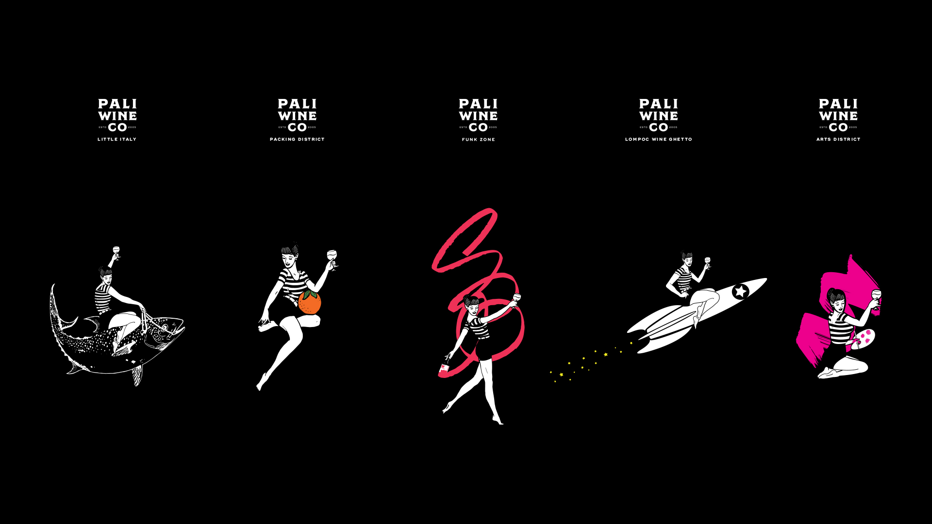
A long relationship and brand evolution blossomed when the winery opened its first urban tasting room. One tasting room led to 4, and the need for unifying and customized elements took hold. An entirely new word mark was developed, along with a distinct visual identity to bring these brand extensions to life. The Pali Gal was a nod to the Palisades (where our founders are from). The love of the ocean, the vintage beach nostalgia – a true Southern California vibe was something ownable for the brand. For each location, we developed custom elements with references to the local history – San Diego’s tuna fishing, Anaheim’s orange packing plants, Lompoc’s rocket industry, Santa Barbara’s Funk Zone, and Downtown LA’s Arts District. A new look and feel unified them all, yet allowed for them each to feel individual in their own ways.
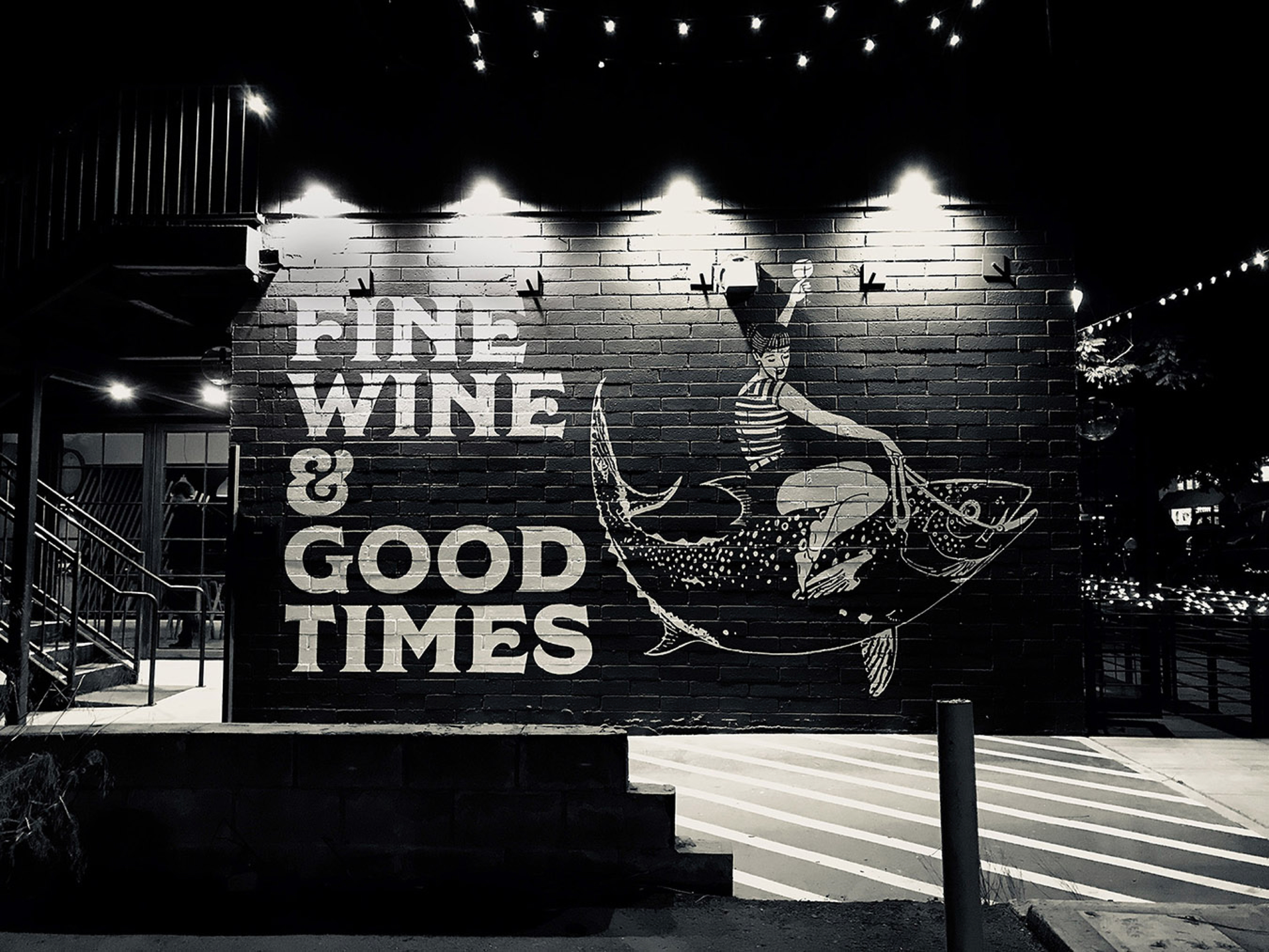
These custom elements were reflected in wall art, exterior murals, and art installations for each location. Even the merchandise was customized to let each customer group feel connected, as only locals can do, repping their neighborhood.
Project Scope
Creative Direction
Brand Strategy
Brand Identity
Packaging
Print Materials
Environmental
Signage
Selected Works
Matthew Wallace WinesBranding, Identity, Packaging, Website
Theorem VineyardsBranding, Identity, Packaging, Environmental
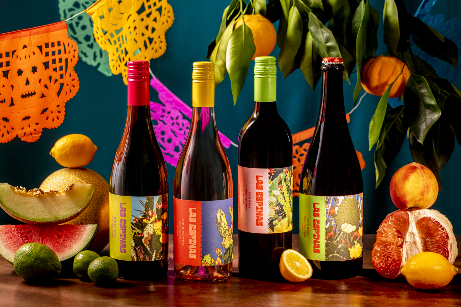
Las EspinasBranding, Identity, Packaging
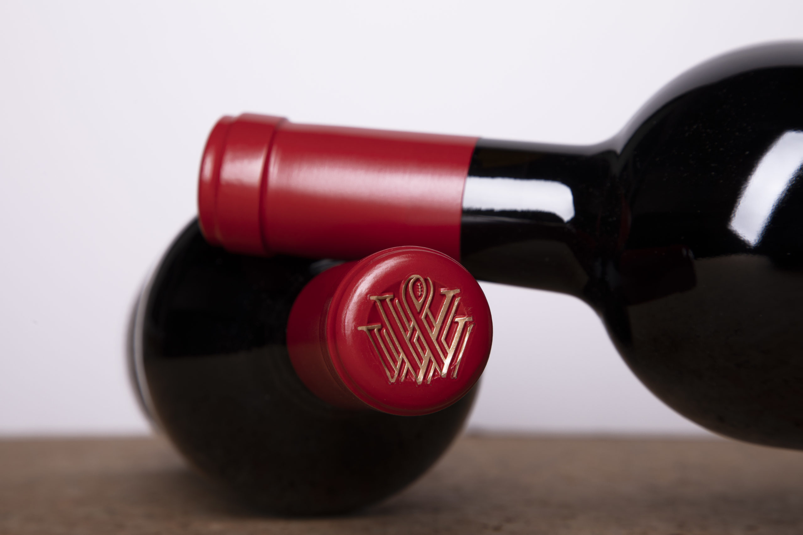
Vermeil WinesBranding, Identity, Packaging, Environmental, Website
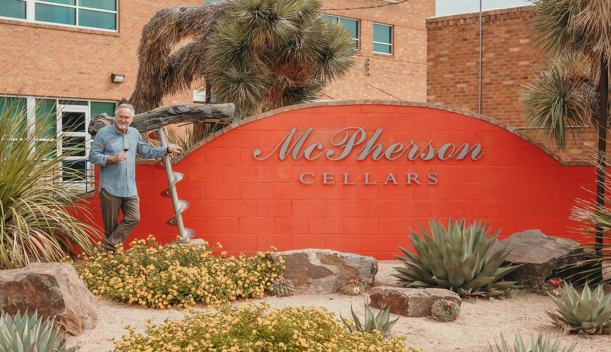
McPherson CellarsBranding, Identity, Packaging, Website
Pali Wine Co.Branding, Packaging, Identity, Environmental
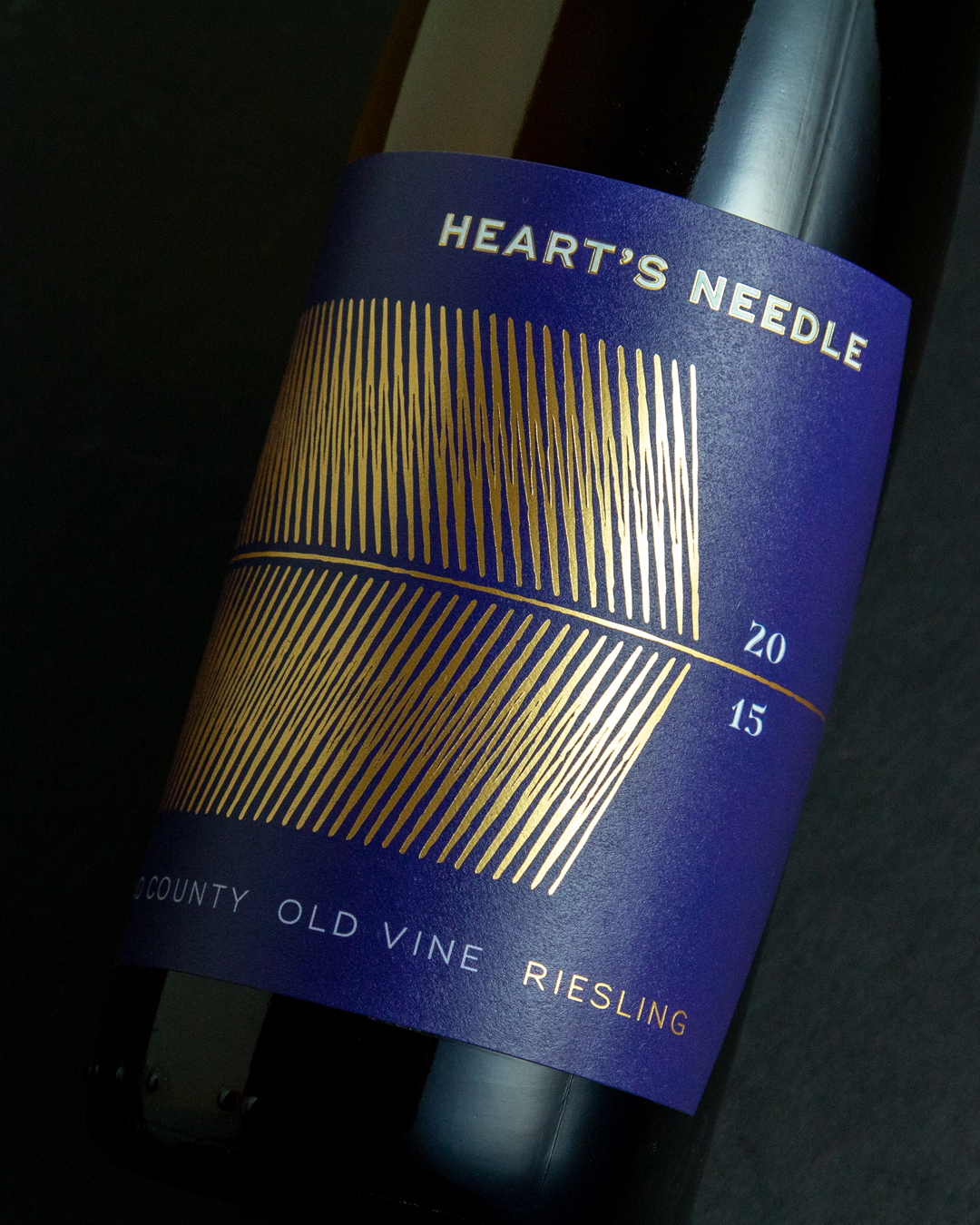
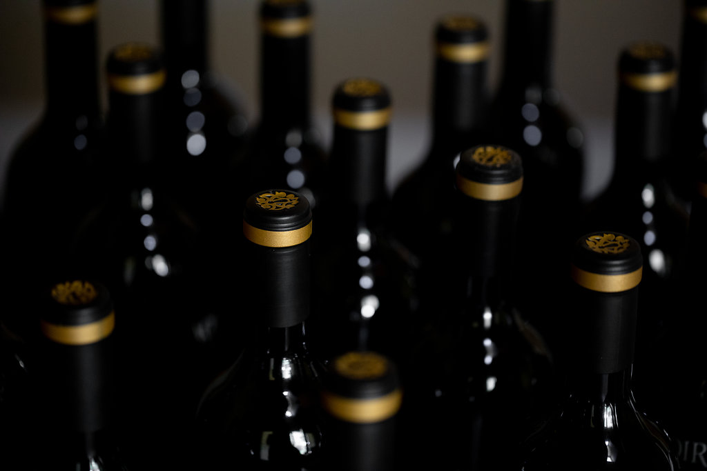
Labels & PackagingBranding, Packaging, Identity

Call: 415.722.1517
Email: info@bronzesf.com
Follow: @bronzesf
Fonts used: Swear by OHNO Type Co
& Halcom by The Northern Block
© Bronze Creative 2025