
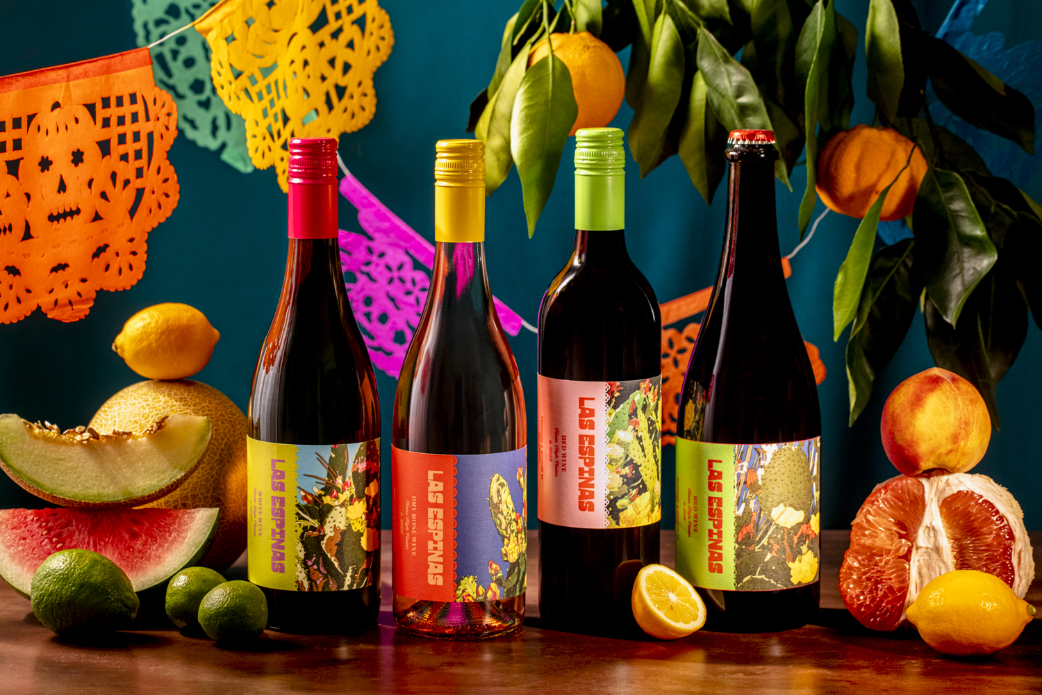
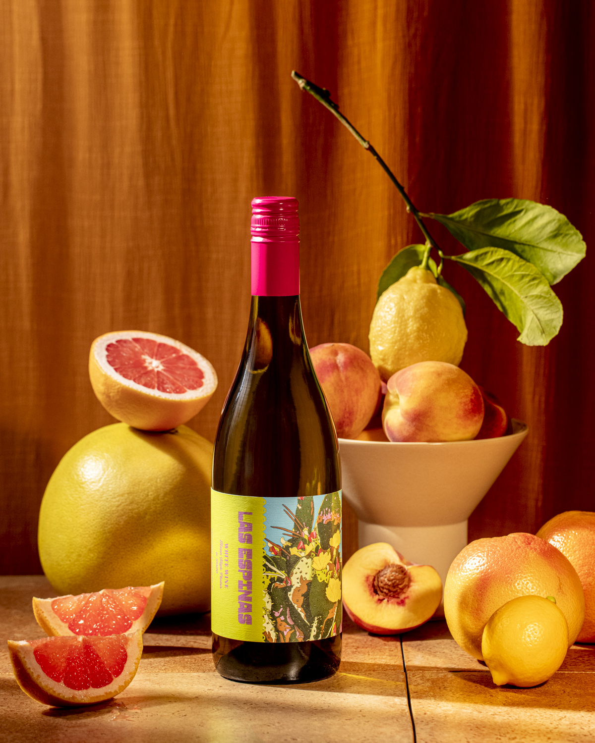
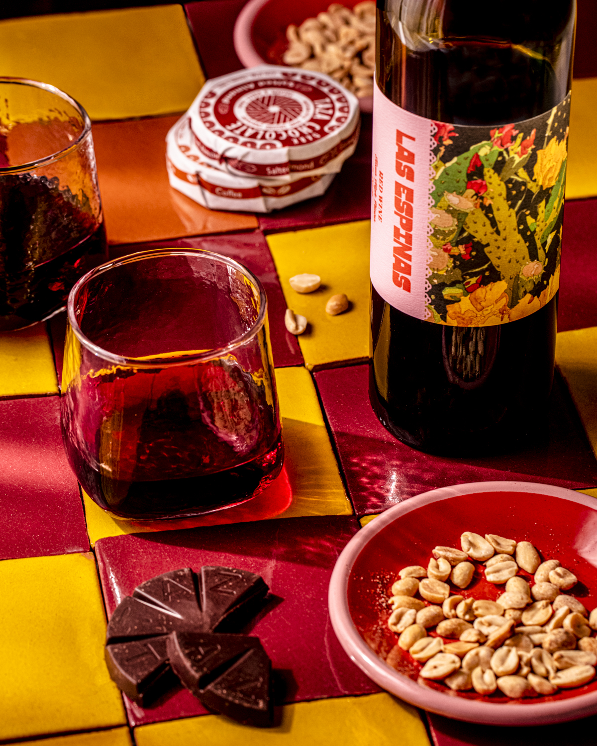
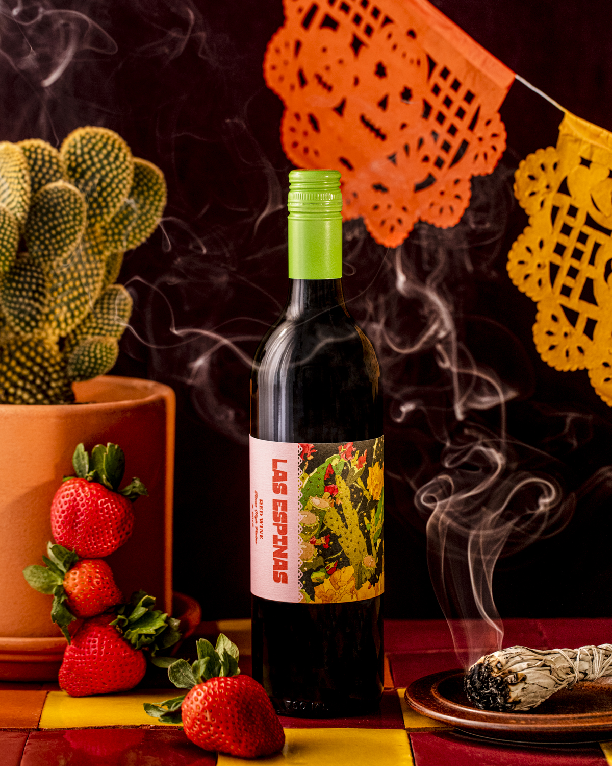
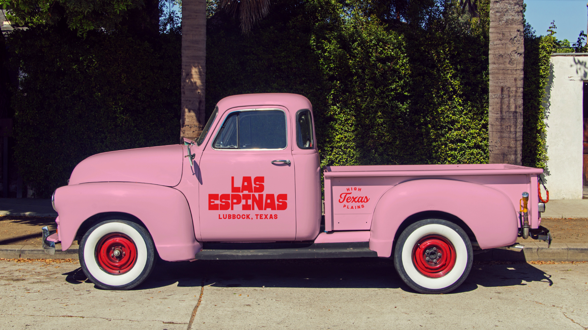
Las Espinas
Embrace constraints, and magic can happen. Neon pink, lime green, high vis yellow? Yes Please!
A brand opportunity presents itself, but there are handcuffs, err.. scratch that, constraints. For this scrappy upstart, it was a constant game of “Yes, and…” A gift of an opportunity to spin off a wine project into a completely new stand alone brand? Yes, and... Available grapes may be variable year to year; low productions would limit our options for glass and closures? Yes, and… The client had a few pieces of work by a local artist they’ve always loved, maybe we could utilize those in some way? Yes, and… Embracing these project constraints gave us something special. A taste of Texas with a distinct TexMex inspired identity reflective of their home town.
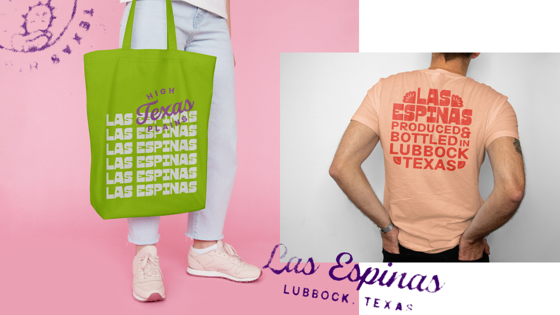
Developing a brand structure was important, with a toolkit of parts which could be mixed, within budget and allow for a wide range of combinations. This would support the businesses go to market strategy with an approachable SRP.
Label color combinations could be mixed and match to fit with the art. Stock screw capsules in bold AF colors would make the package feel anything but stock. Neon pink, lime green, high vis yellow? Yes please!
Project Scope
Brand Identity
Packaging
Selected Works
Matthew Wallace WinesBranding, Identity, Packaging, Website
Theorem VineyardsBranding, Identity, Packaging, Environmental
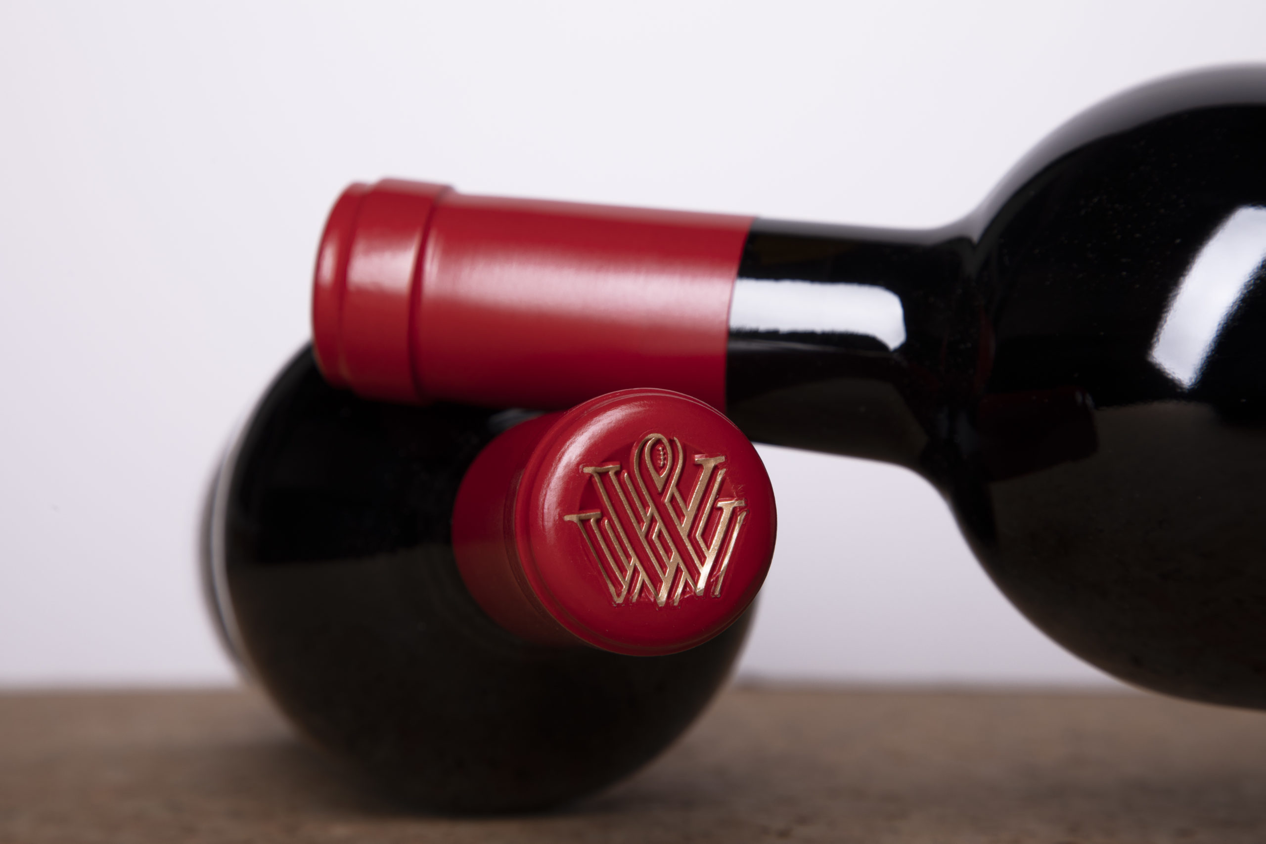
Las EspinasBranding, Identity, Packaging
Vermeil WinesBranding, Identity, Packaging, Environmental, Website
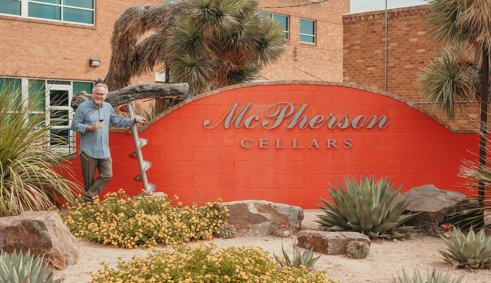
McPherson CellarsBranding, Identity, Packaging, Website
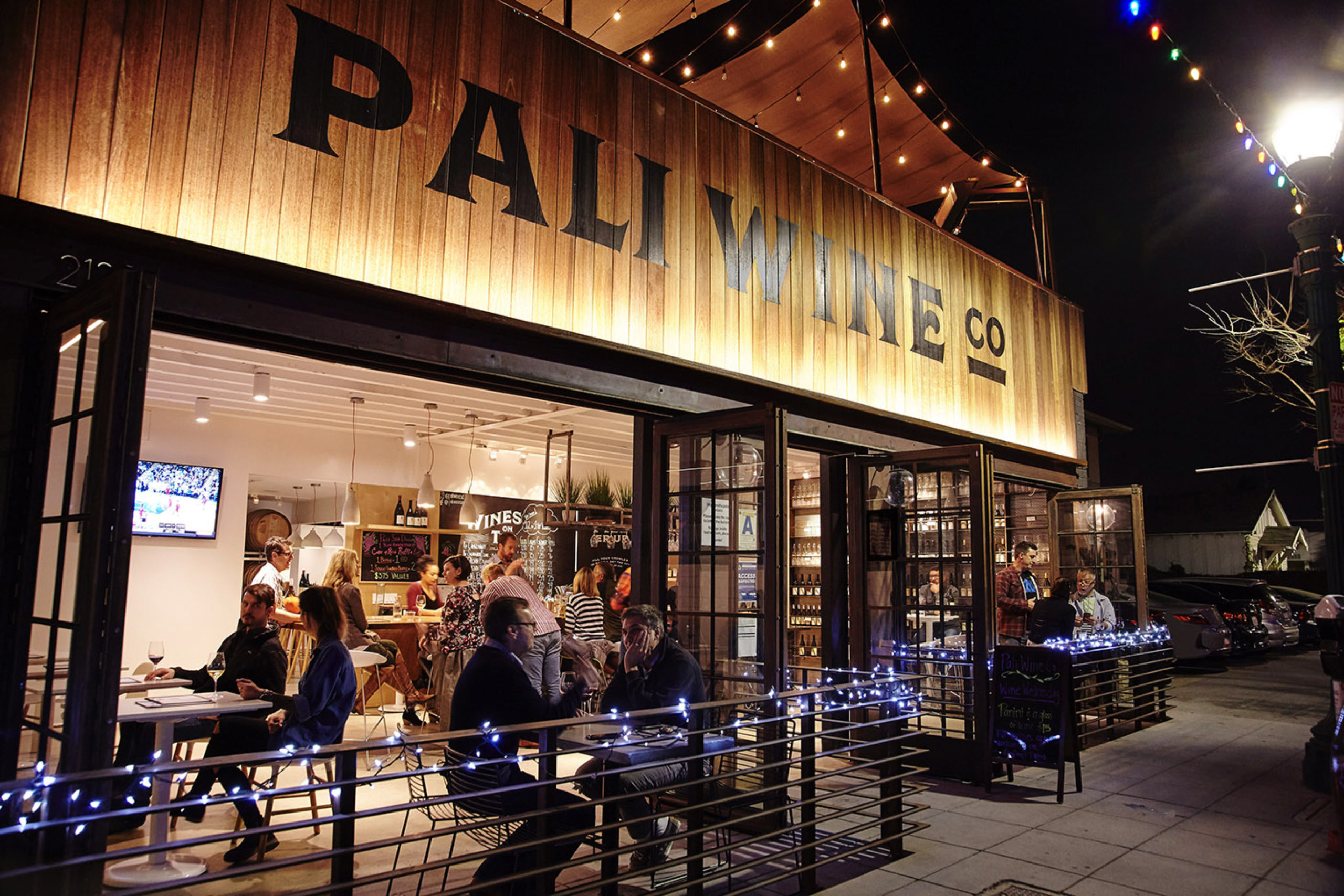
Pali Wine Co.Branding, Packaging, Identity, Environmental
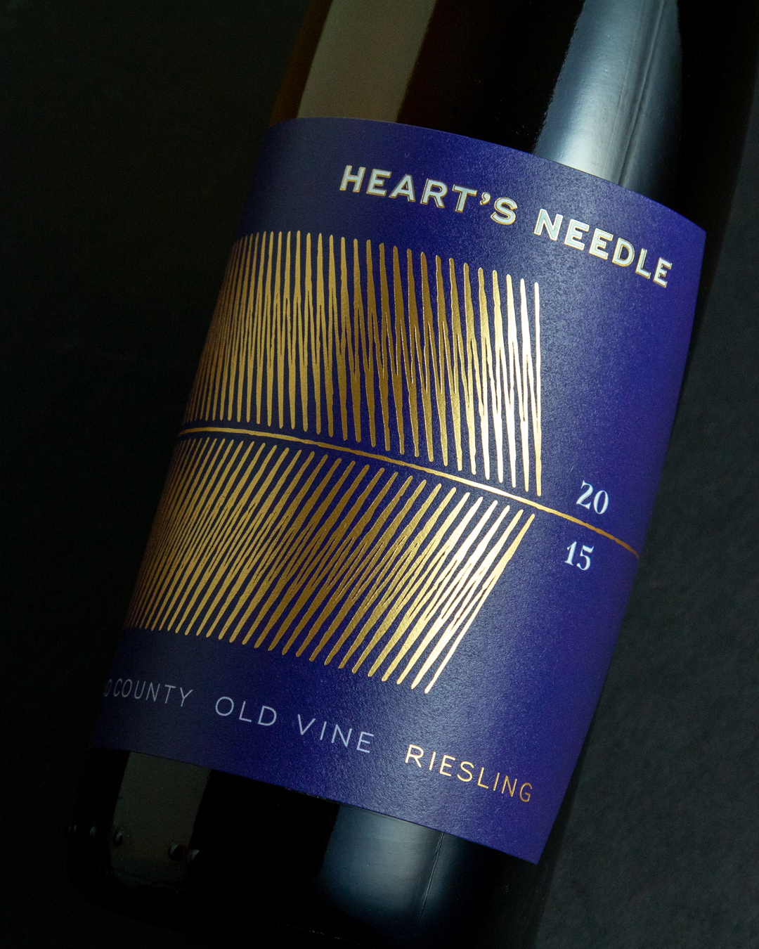
Labels & PackagingBranding, Packaging, Identity

Call: 415.722.1517
Email: info@bronzesf.com
Follow: @bronzesf
Fonts used: Swear by OHNO Type Co
& Halcom by The Northern Block
© Bronze Creative 2025