
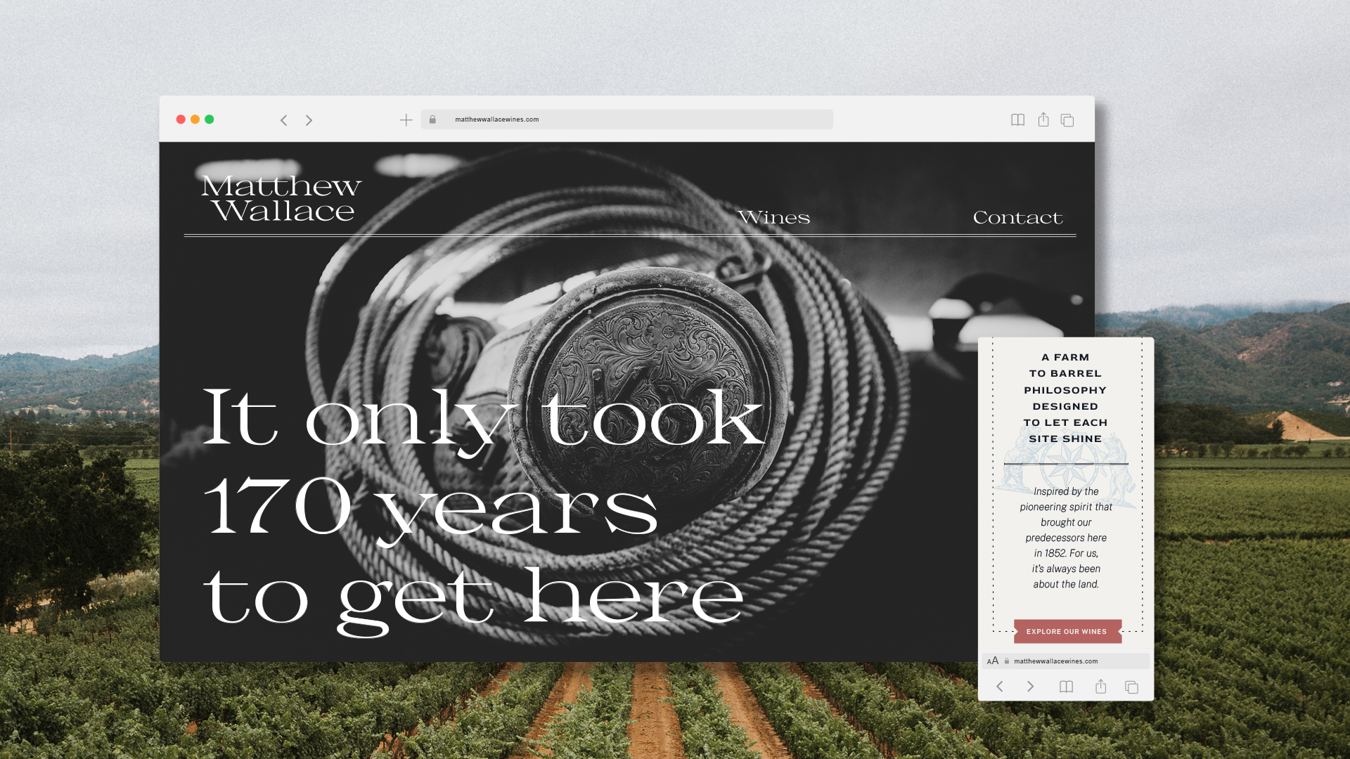
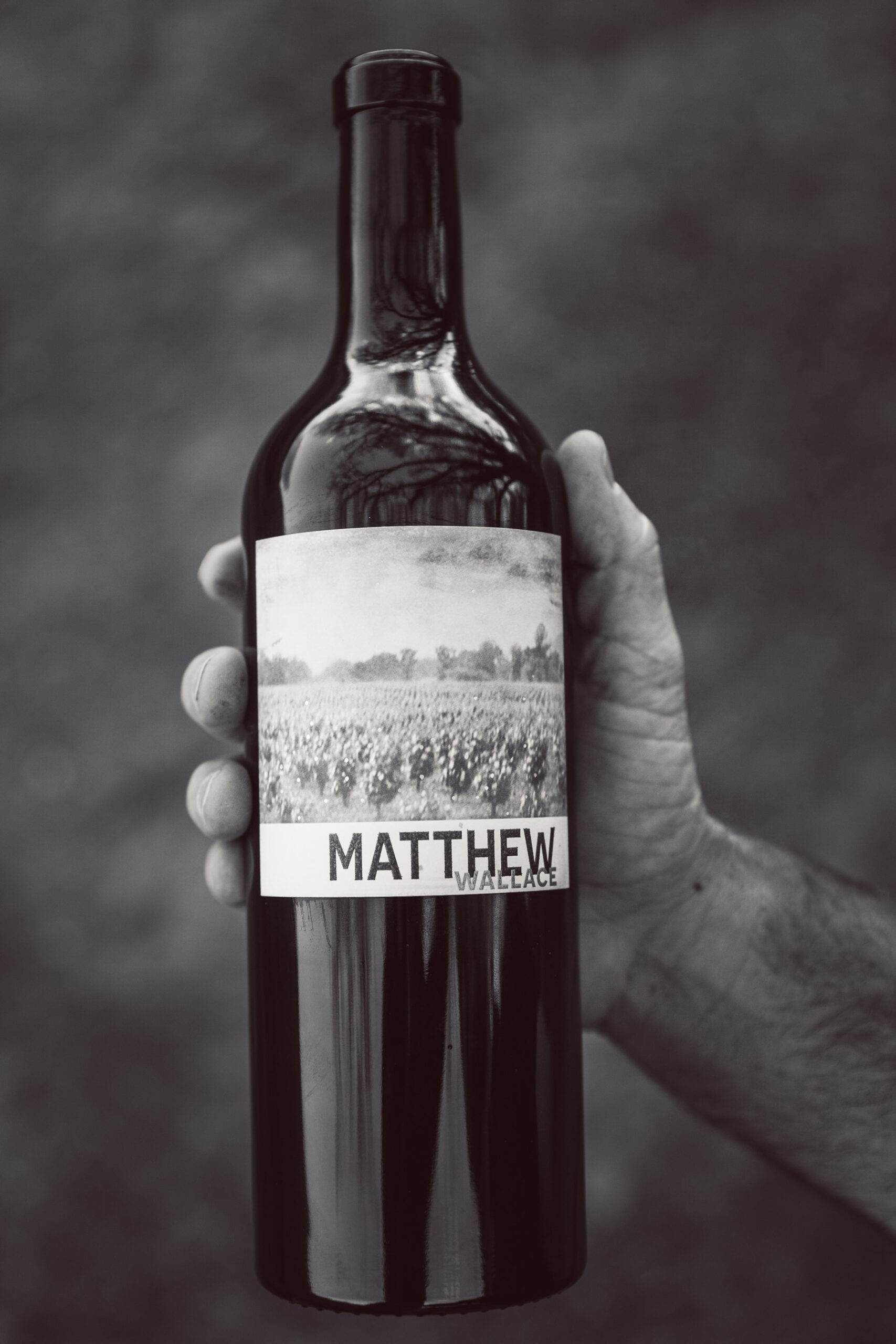
Matthew Wallace Wines
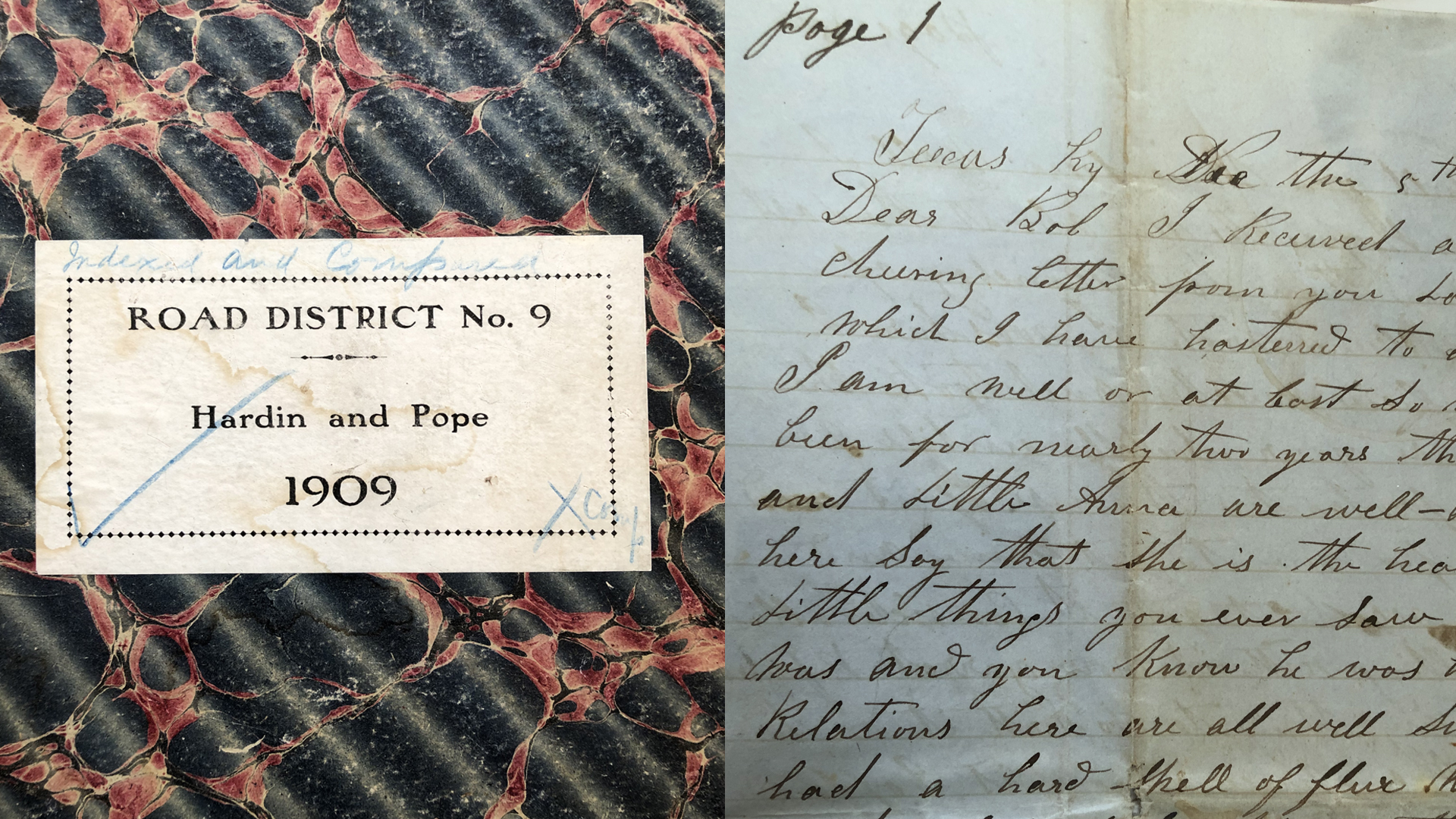
The look and feel is inspired by family letters and record books more than a century old.
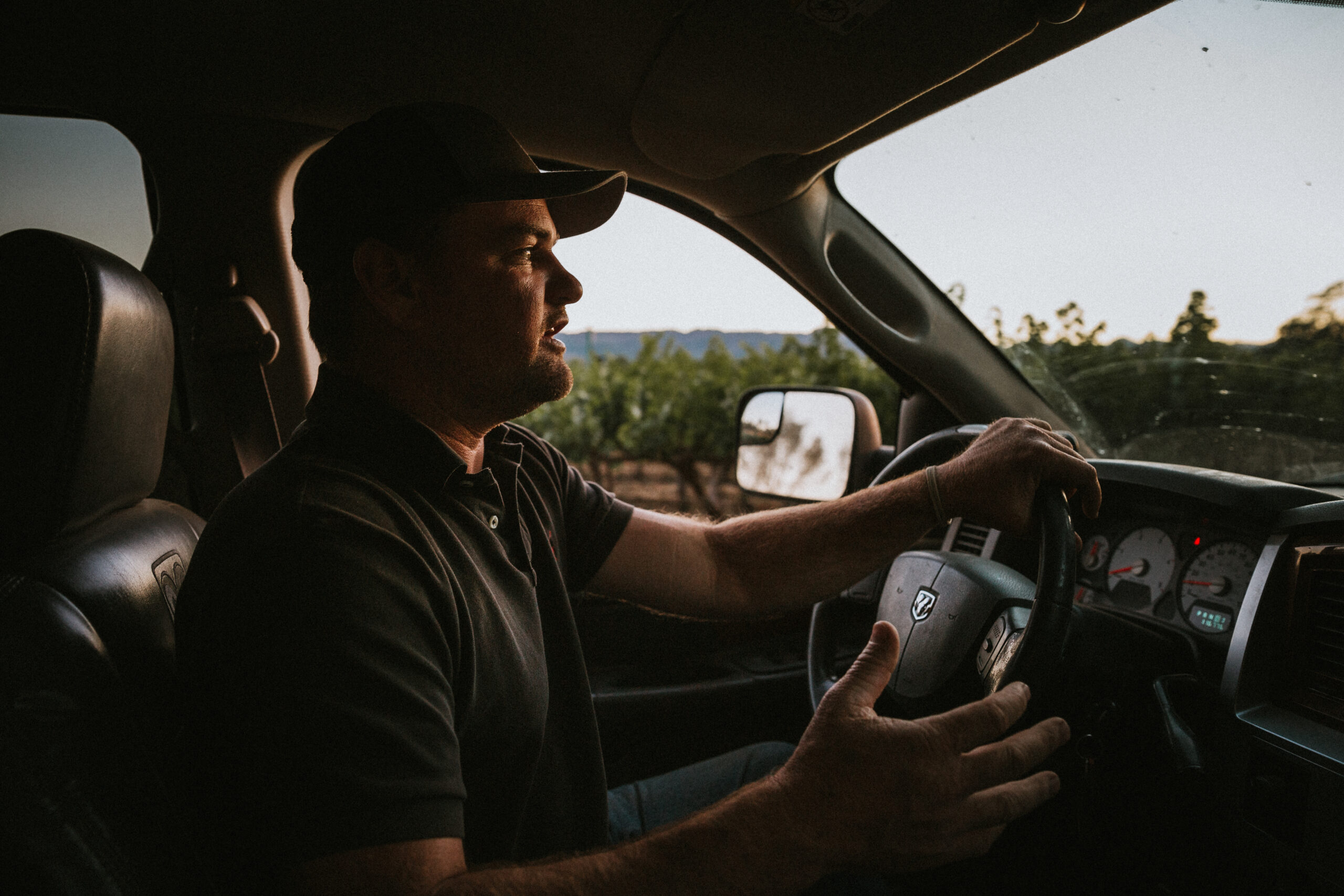
Matt Hardin’s family is 7 generations deep in Napa Valley. So deep, the family first dug into the dirt pre-dating California’s state hood. Our concept was to tip a hat to the history, but make it new, make it “Matt”. The look and feel is inspired from the family archives — family letters and farming record books more than a century old.
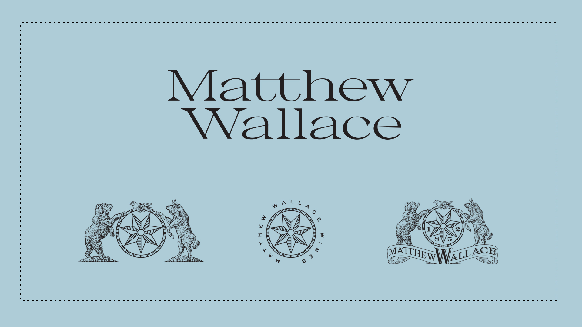
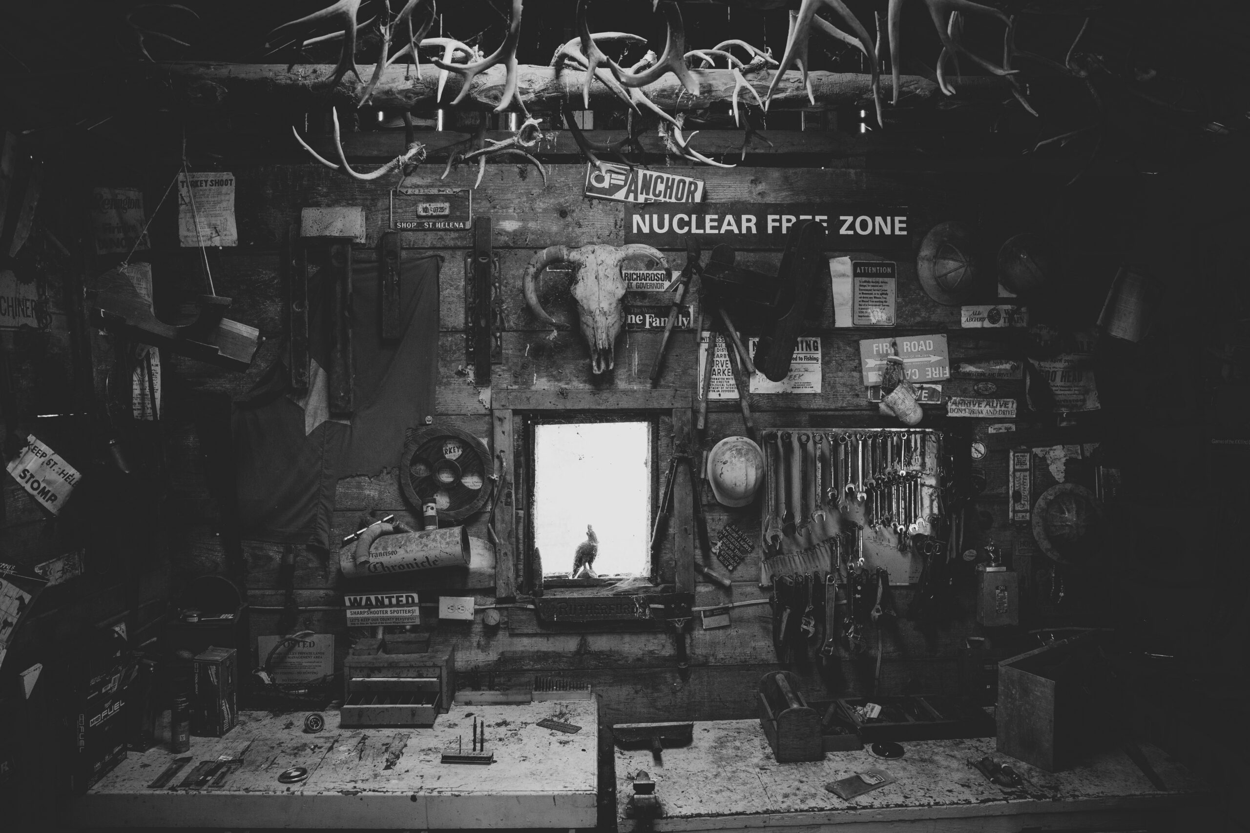
The icon set references the family history of cattle ranching (actually, the first registered cattle brand in Napa county!), the bear republic, a martlet as a nod to mom’s family crest, plus the 7 points in the compass rose for each generation finding their way.
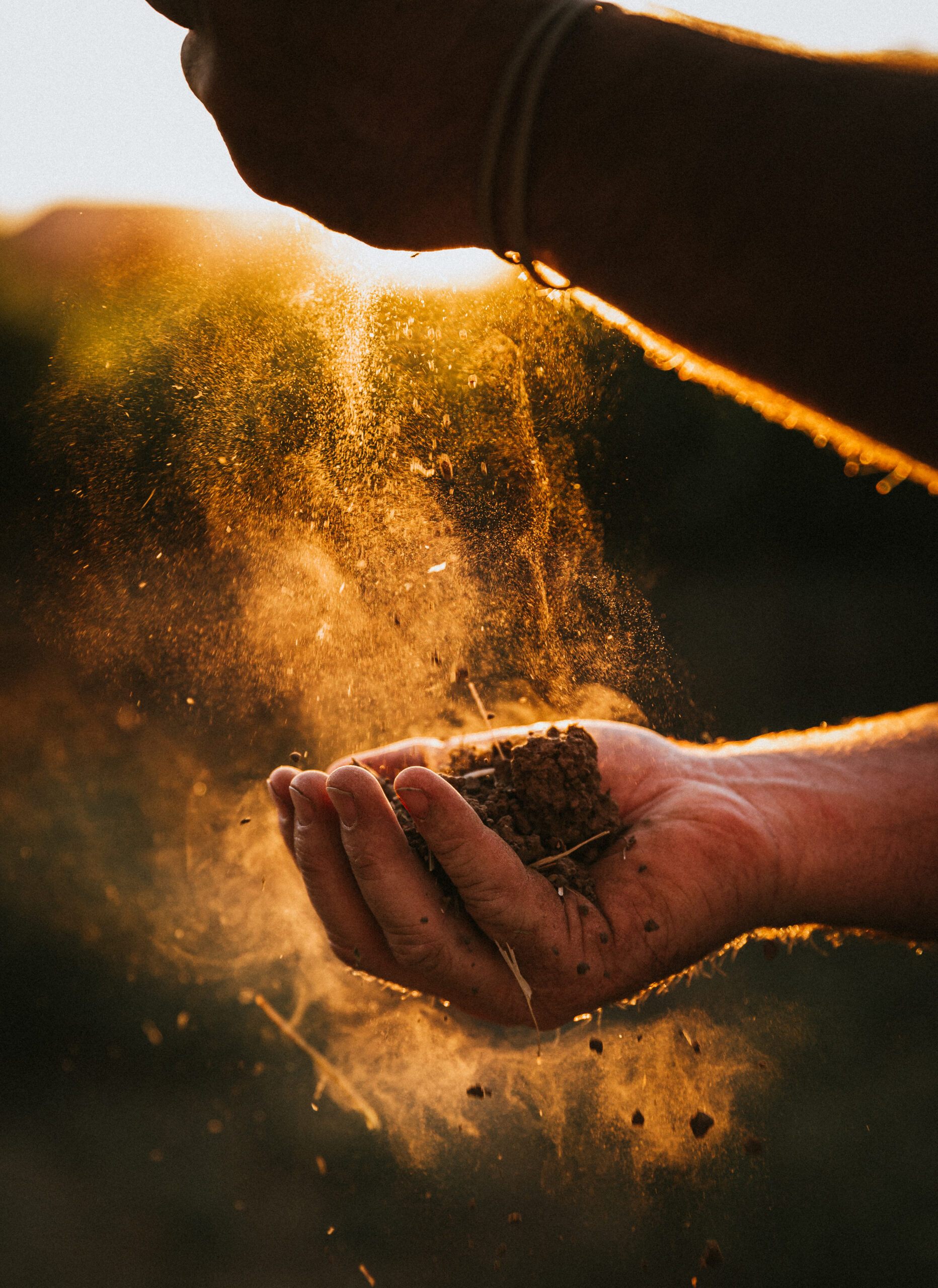
First and foremost, Matt is a farmer, rancher and wine grower who wants to show off the best of his abilities. How do you rebrand a wine to put the land forward? The previous branding didn’t reflect his values or vision. We worked closely with Matt to rewrite and codify all of that.
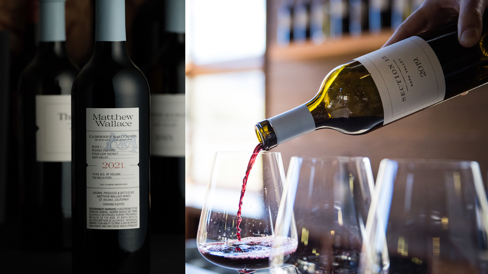
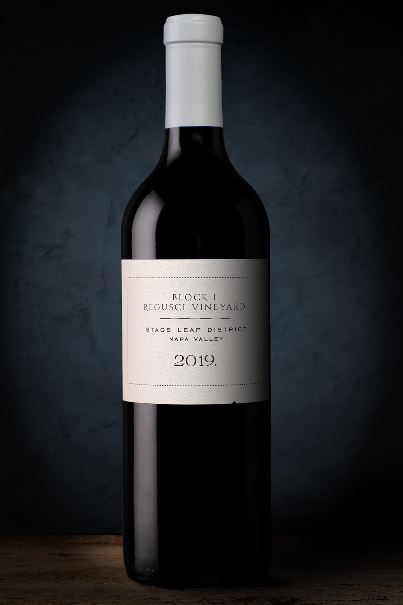
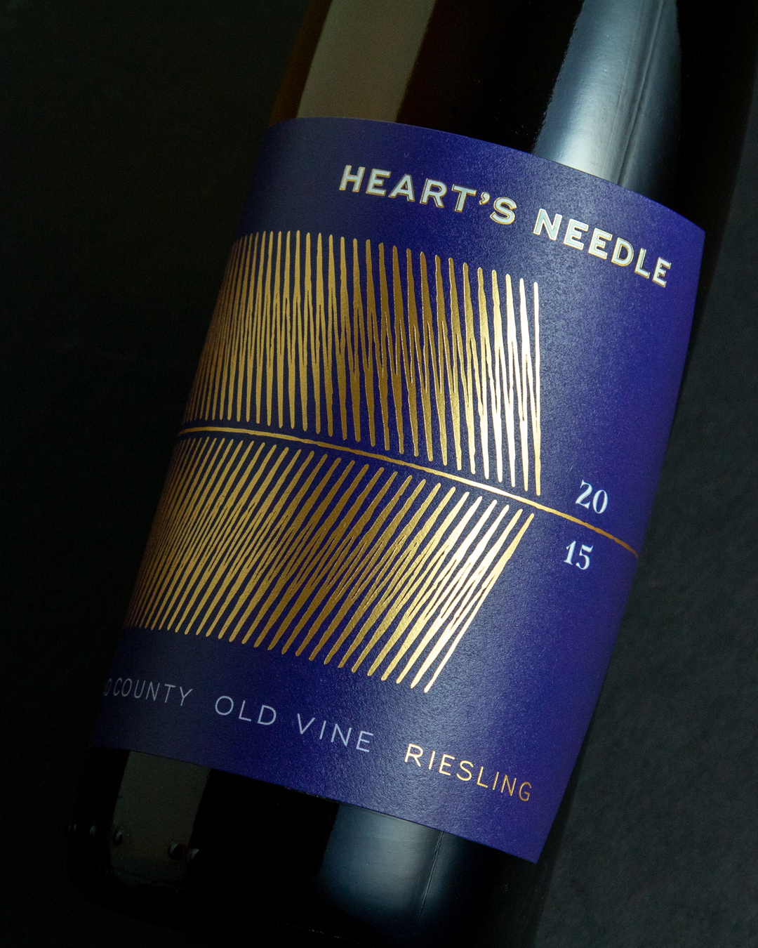
And those record books from the family archives? More out of function and ease, they used a variety of typefaces year to year. This would inform the variety of lettering for each vineyard’s label, yet with modern typefaces. This time with intention. Make them stand out from each other, but bring them together as a family of wines. For a farmer who believes site matters most, we challenged him to list only vineyard names on the front labels. He immediately agreed. What stands is a bold reference to the past, but looks forward.
Project Scope
Creative Direction
Brand Strategy & Messaging
Brand Identity
Packaging
Web Design
Copywriting
Content Strategy
Selected Works
Matthew Wallace WinesBranding, Identity, Packaging, Website
Theorem VineyardsBranding, Identity, Packaging, Environmental
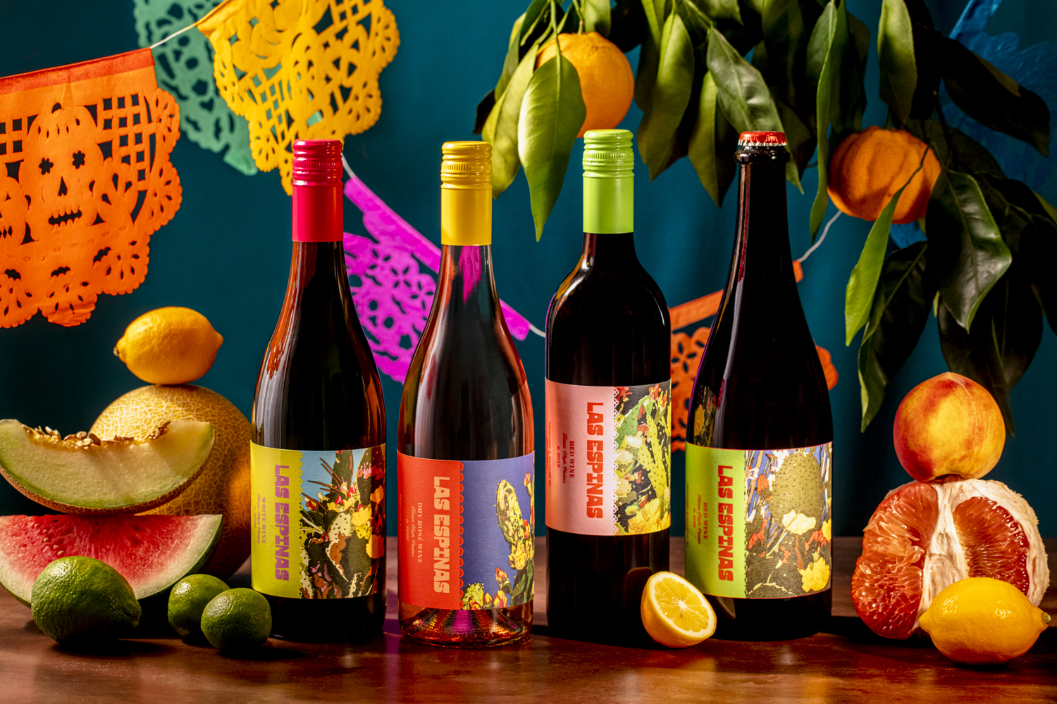
Las EspinasBranding, Identity, Packaging
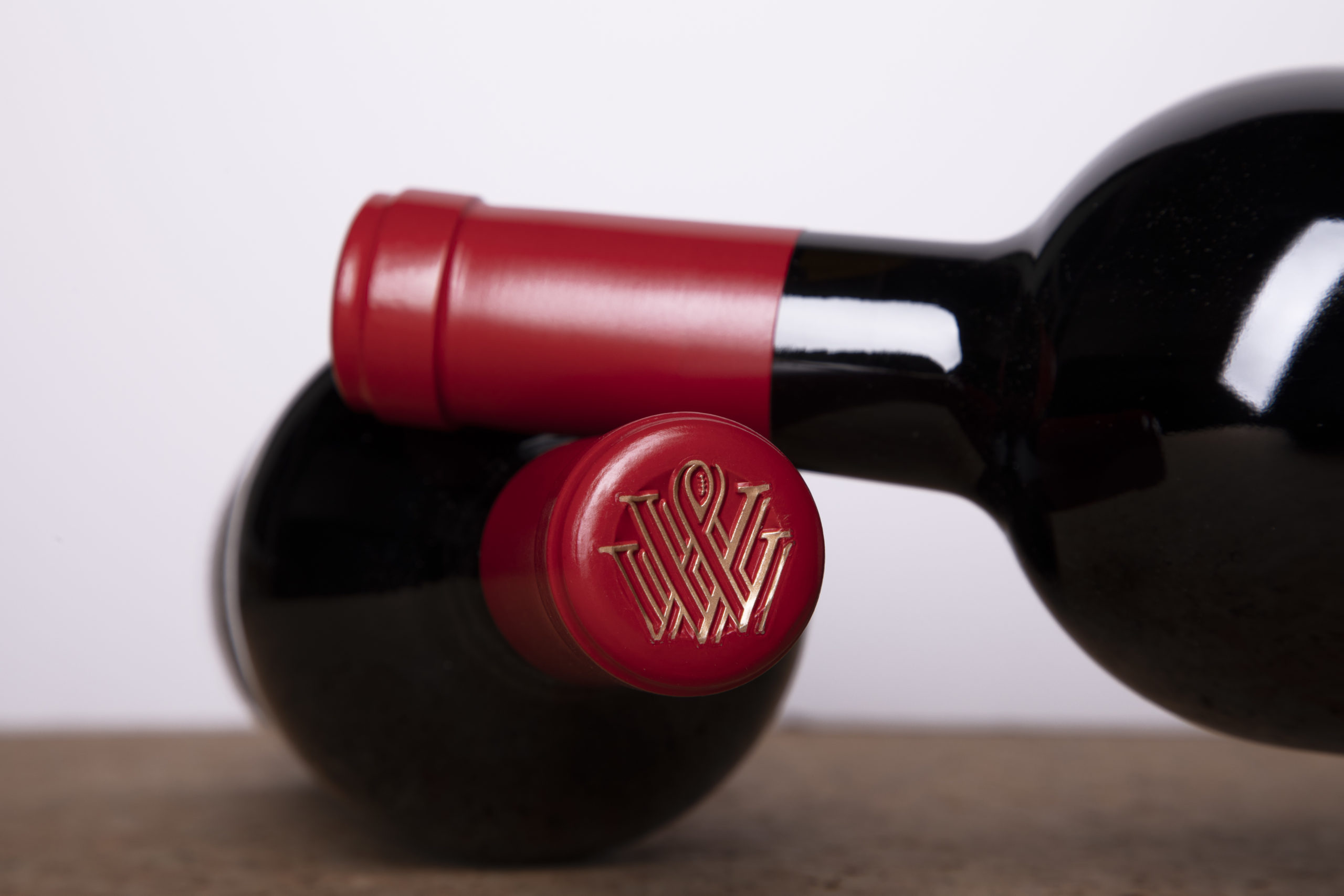
Vermeil WinesBranding, Identity, Packaging, Environmental, Website
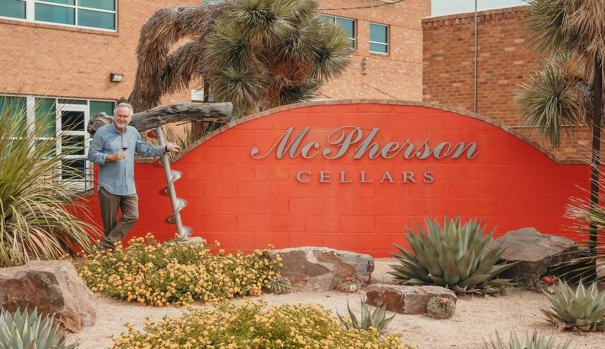
McPherson CellarsBranding, Identity, Packaging, Website
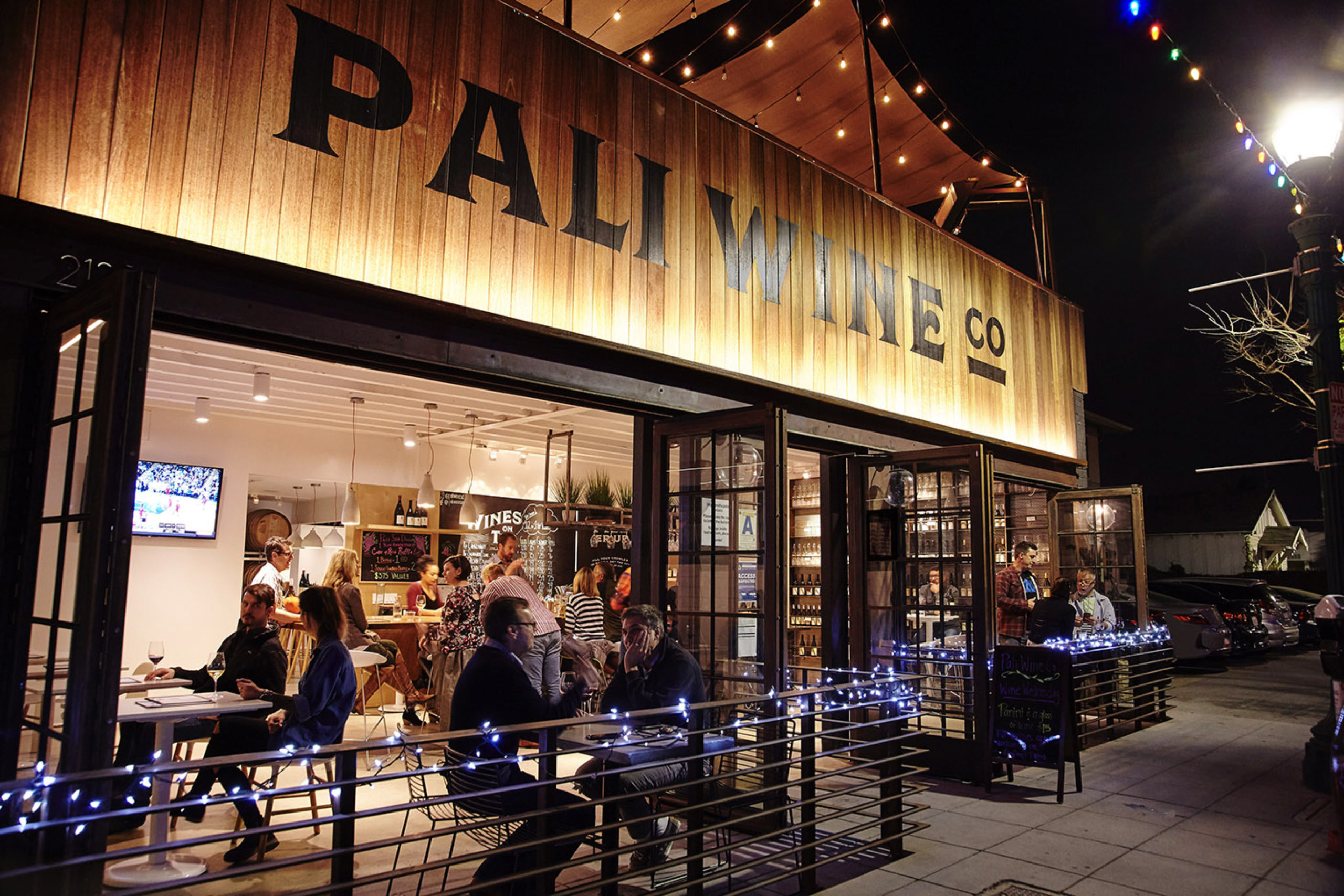
Pali Wine Co.Branding, Packaging, Identity, Environmental
Labels & PackagingBranding, Packaging, Identity

Call: 415.722.1517
Email: info@bronzesf.com
Follow: @bronzesf
Fonts used: Swear by OHNO Type Co
& Halcom by The Northern Block
© Bronze Creative 2025